 JAPAN'S BEST-DESIGNED OFFICES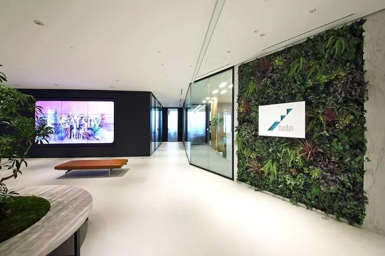
Concept
Three themes
Mandom consolidated from several floors to one, around three themes: livelier communication, better hospitality, and showing what makes the company itself.
The entrance shows a full cosmetics maker — top share in men’s cosmetics, and women’s and healthcare products too — with clean white, the corporate green as an accent, and careful choice of colour and texture.
01 · Entrance
Plants, screens and service
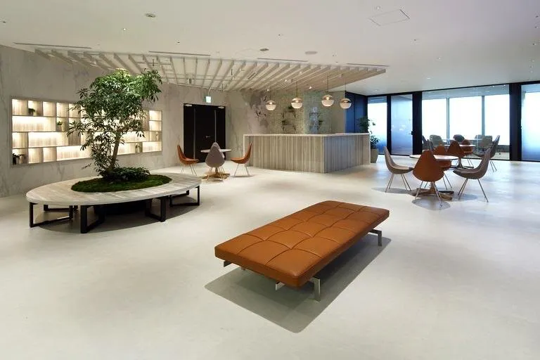
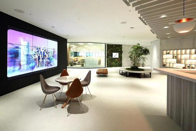
The logo stands out against a wall that blends artificial and living plants. A large screen plays videos and welcome messages, flat benches and a doughnut-shaped bench round a planter wait for guests, and a counter at the back is for serving them.
02 · Guest rooms
Each with its own character
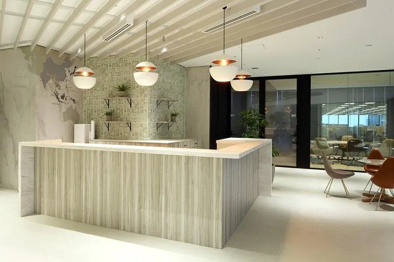
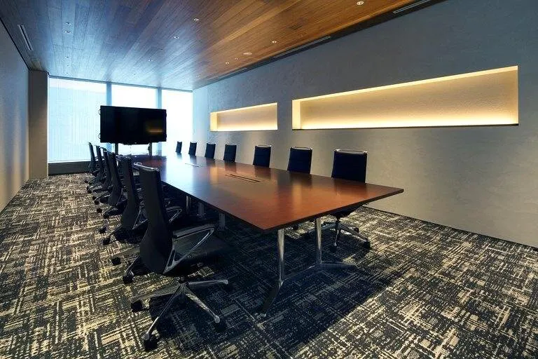
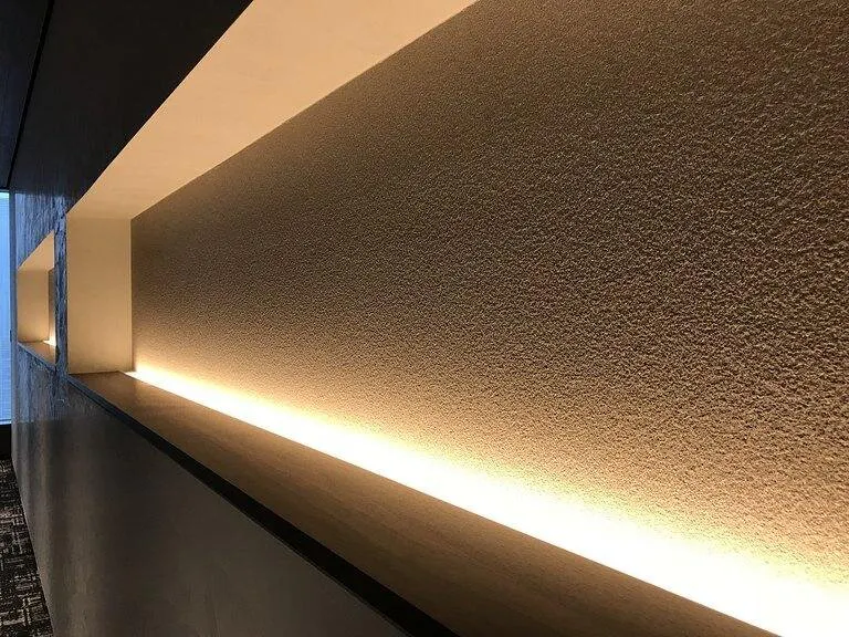
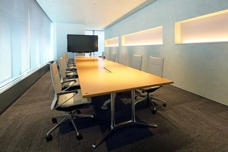
The reception room contrasts with the entrance in a calmer finish. The presentation rooms each have their own personality: one luxurious, with lit niches to display products; the other light and airy.
03 · Office
A grid that never quite repeats
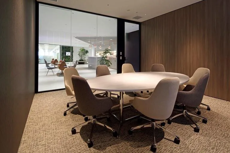
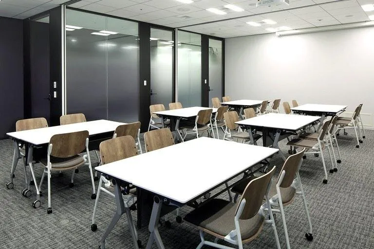
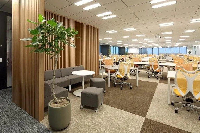
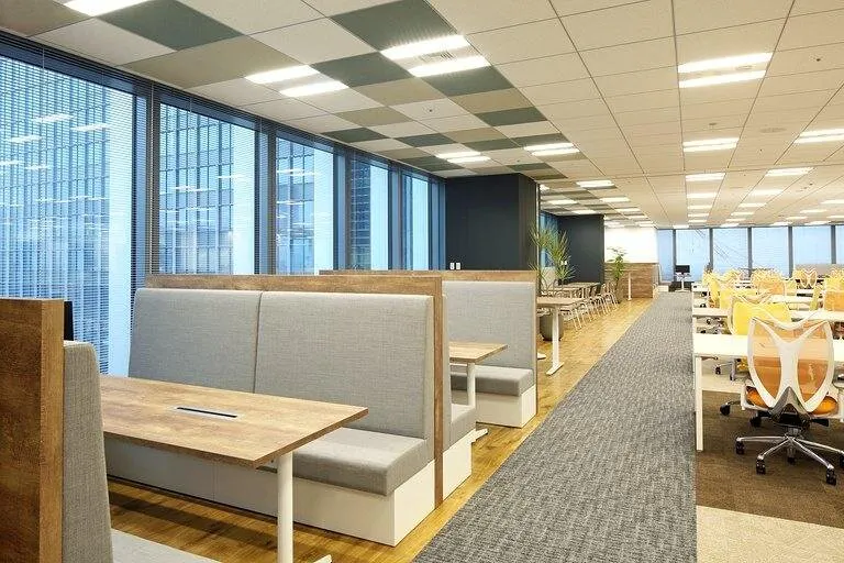
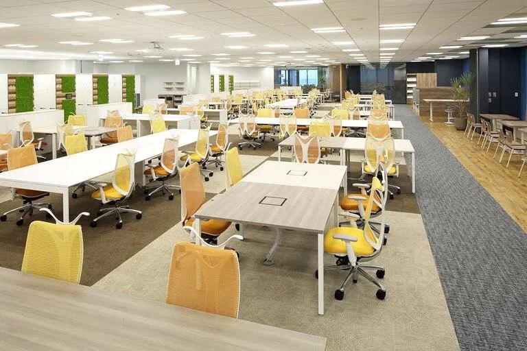
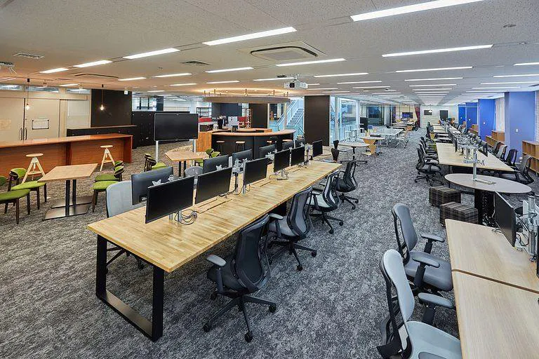
The work area uses group address, and desks are laid out across and along a grid so that neighbours do not become fixed. A section seen through clear glass from the entrance shows the life of the office, and the windows hold different settings for meetings.
 NEW
NEW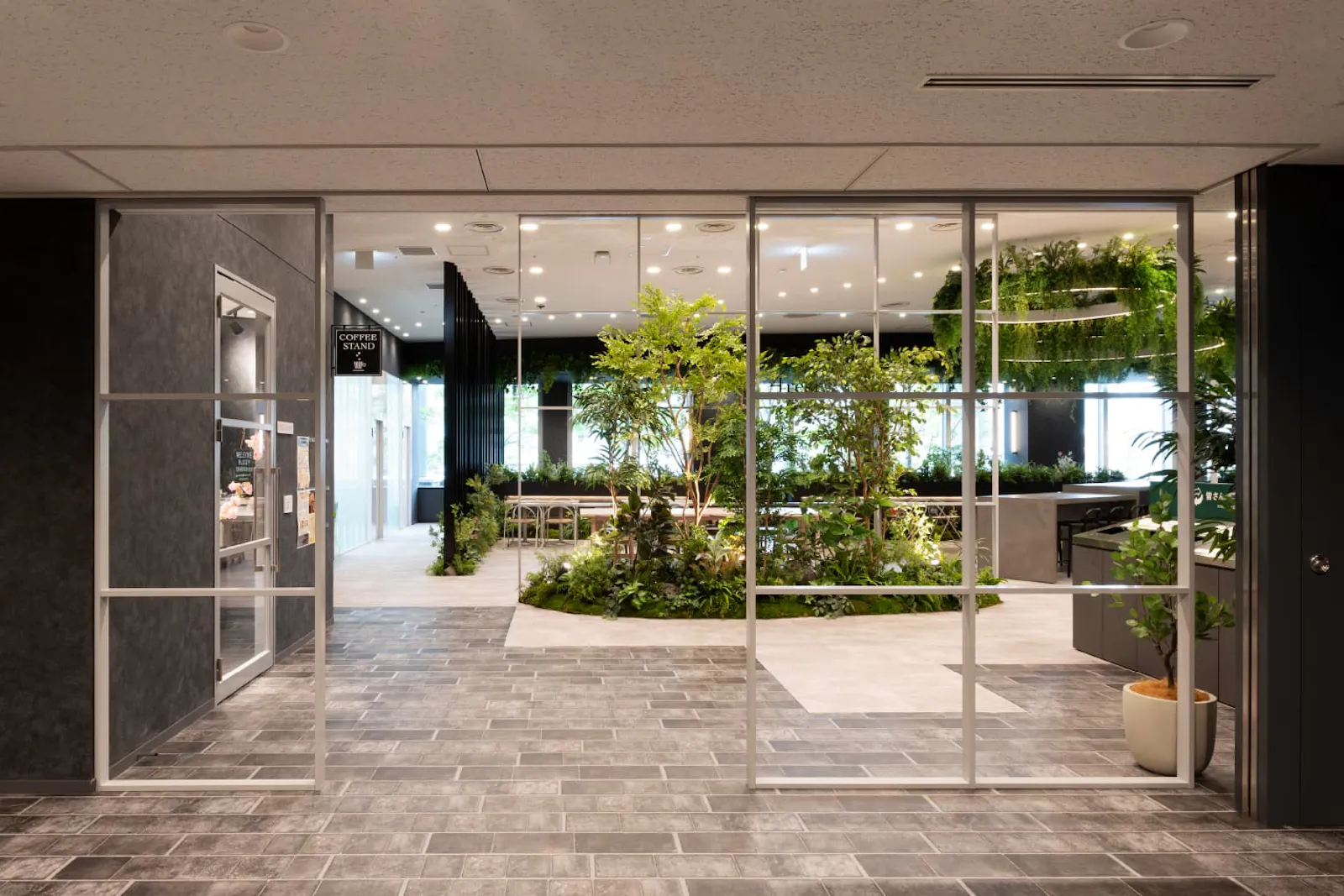 NEW
NEW NEW
NEW