 JAPAN'S BEST-DESIGNED OFFICES
Concept
A world map on the wall, and a rule about paint
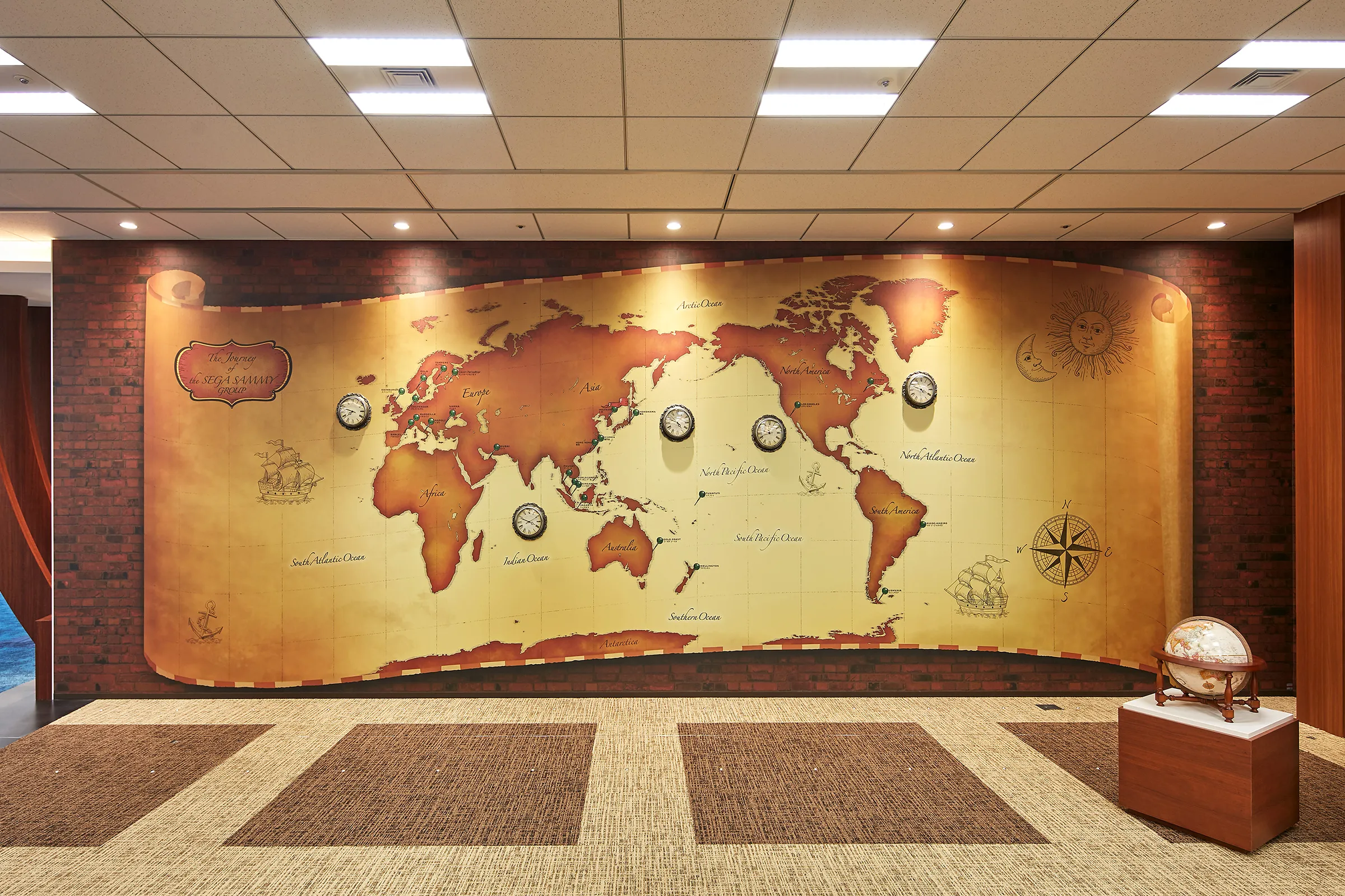
Atlus states one thing about its meeting rooms that most companies would not bother to state: that no two of them are the same. Not the wall colour, not the furniture. A room is identified by a letter, and the letter stands for a port city — H for Hong Kong, N for Naples — and one of the rooms carries a world map painted across the whole of one wall, with the ports marked on it.
It is a small piece of scheduling design doing a larger job. A studio that ships long, narrative games keeps teams in a room for months at a time; giving each room a different face means that “we are in Naples” carries an image rather than a number. The working floor itself takes the opposite approach — organised by production rather than by department, and with nothing dividing one team from the next.
01 · The floor
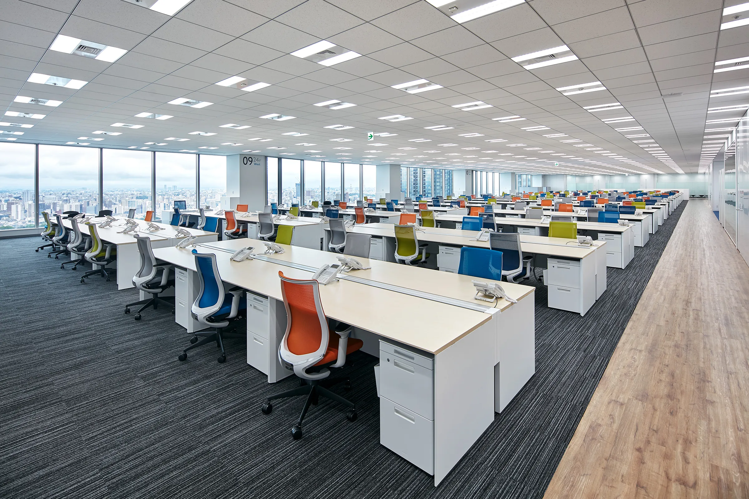
Grouped by what is being made
The desks are arranged by production rather than by function, and there are no walls between one team and another.
02 · The rooms
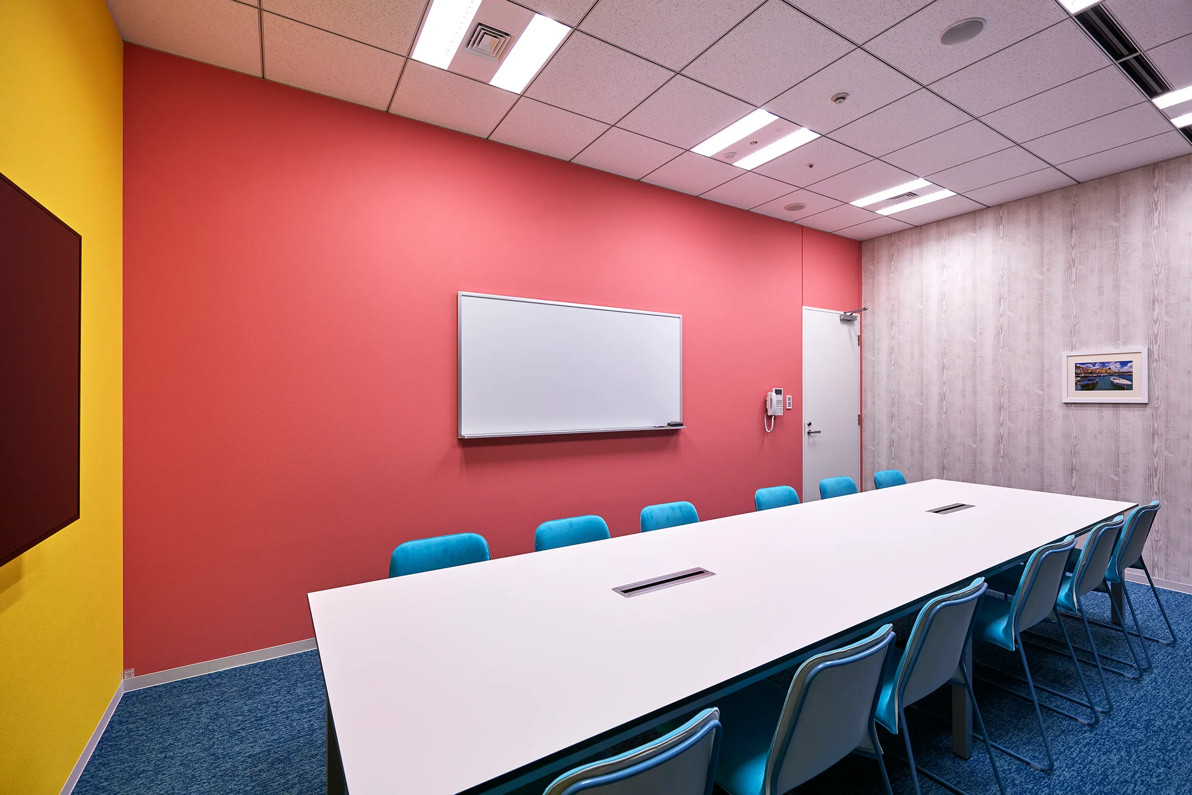
A letter, a city, a colour
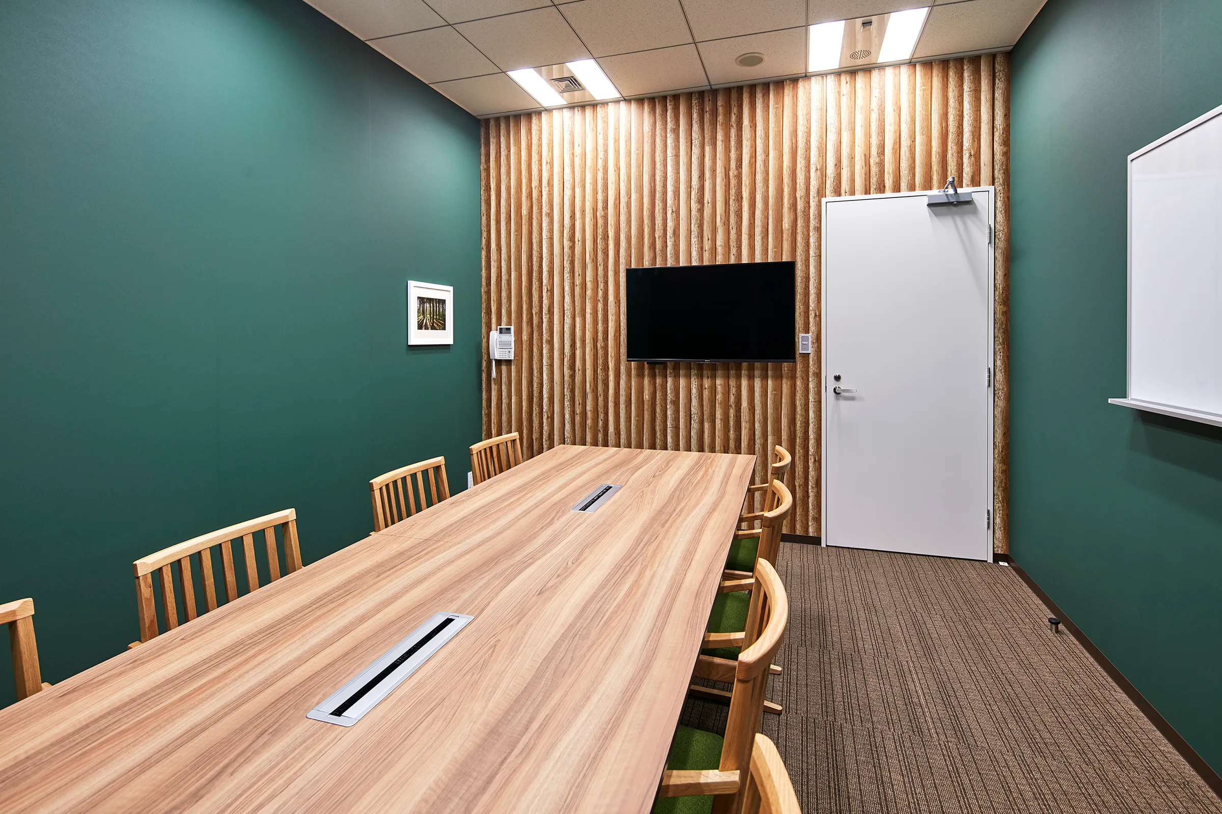
Each meeting room takes a letter and a port city. One of them is given over to a painted map of the world; the others run to strong single colours — a red and yellow room, a green one panelled in wood.
03 · The communication space
Coffee, tea, fruit water
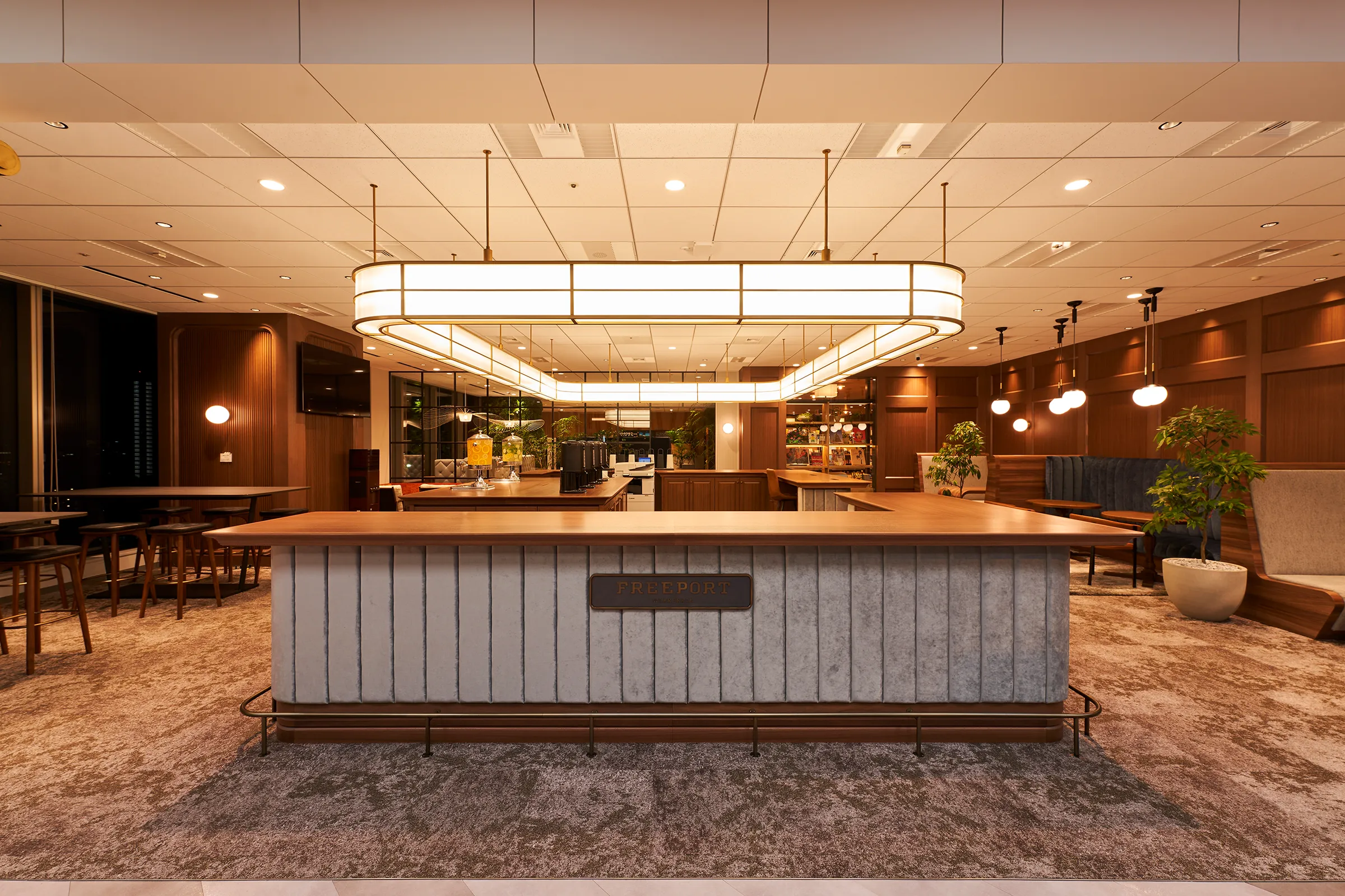
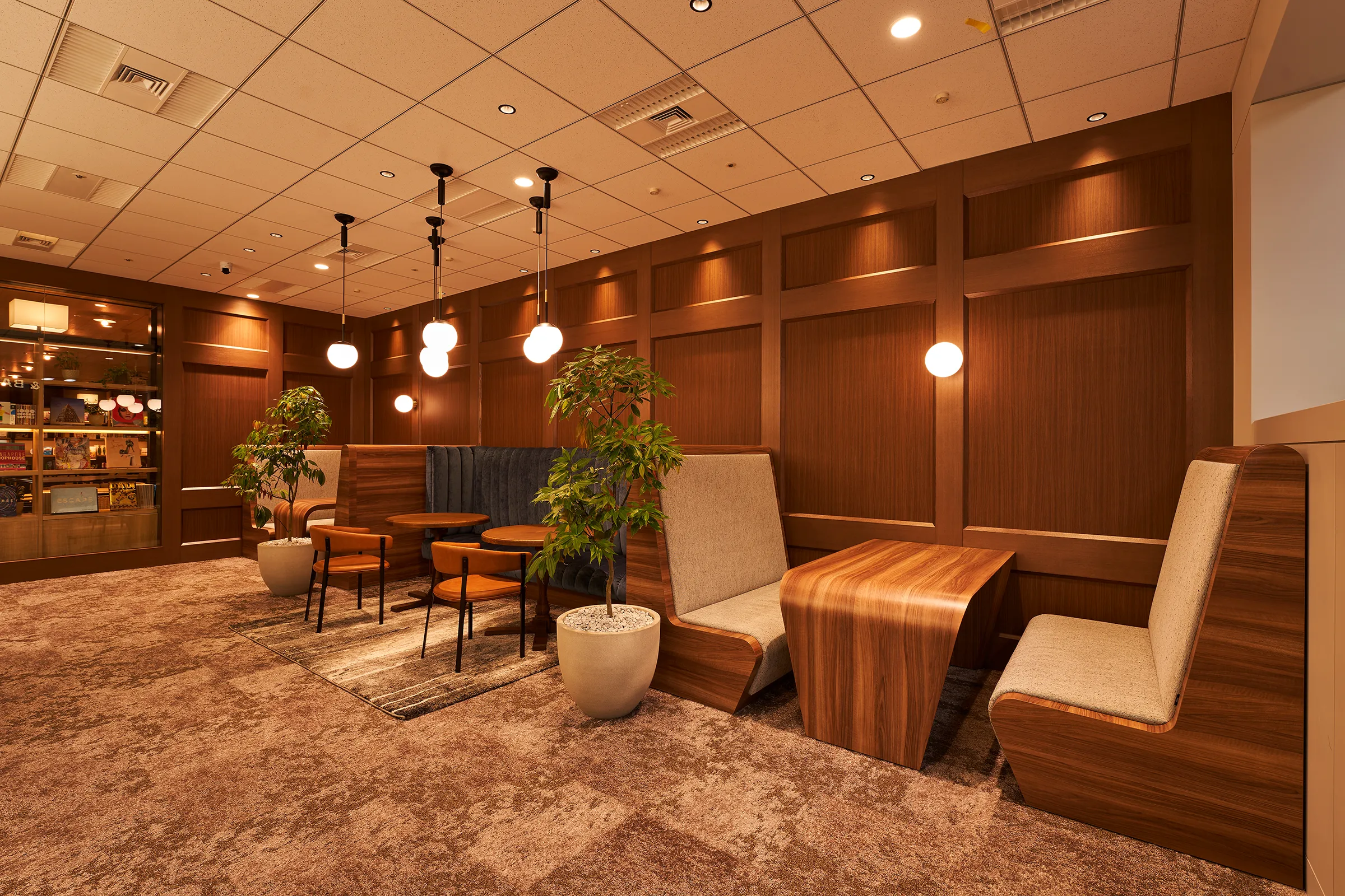
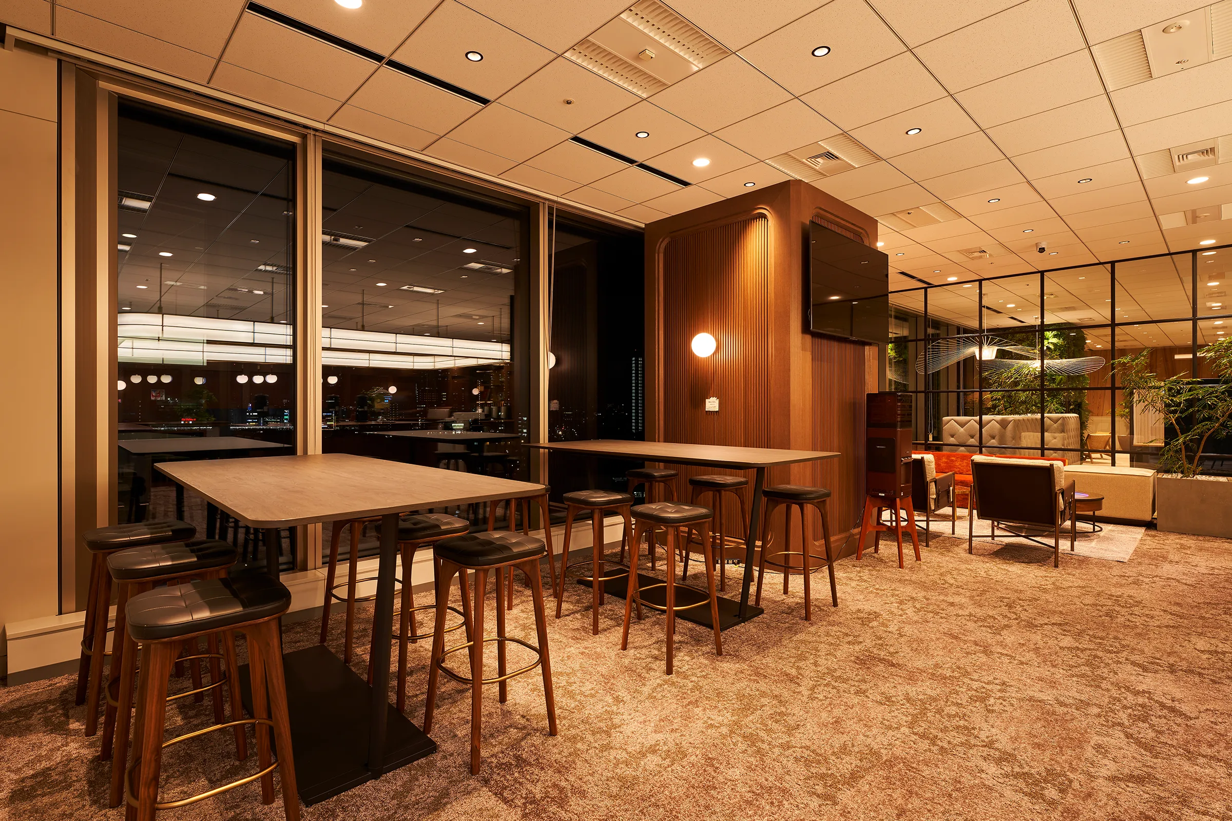
A counter with a lit canopy over it serves coffee, tea and fruit water at no charge, with booth seating and low tables around it.
04 · The library
Books that change, and a screen
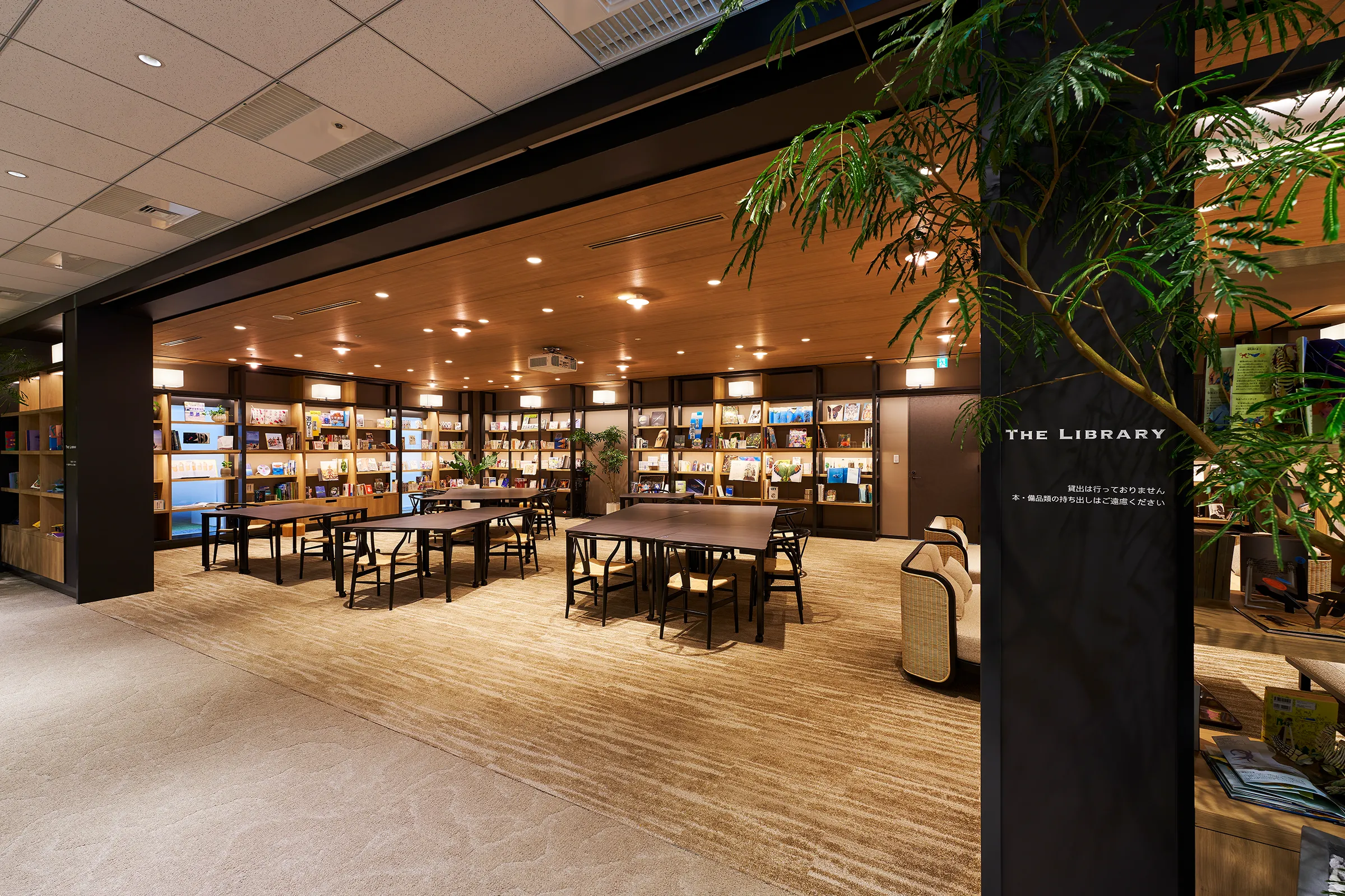
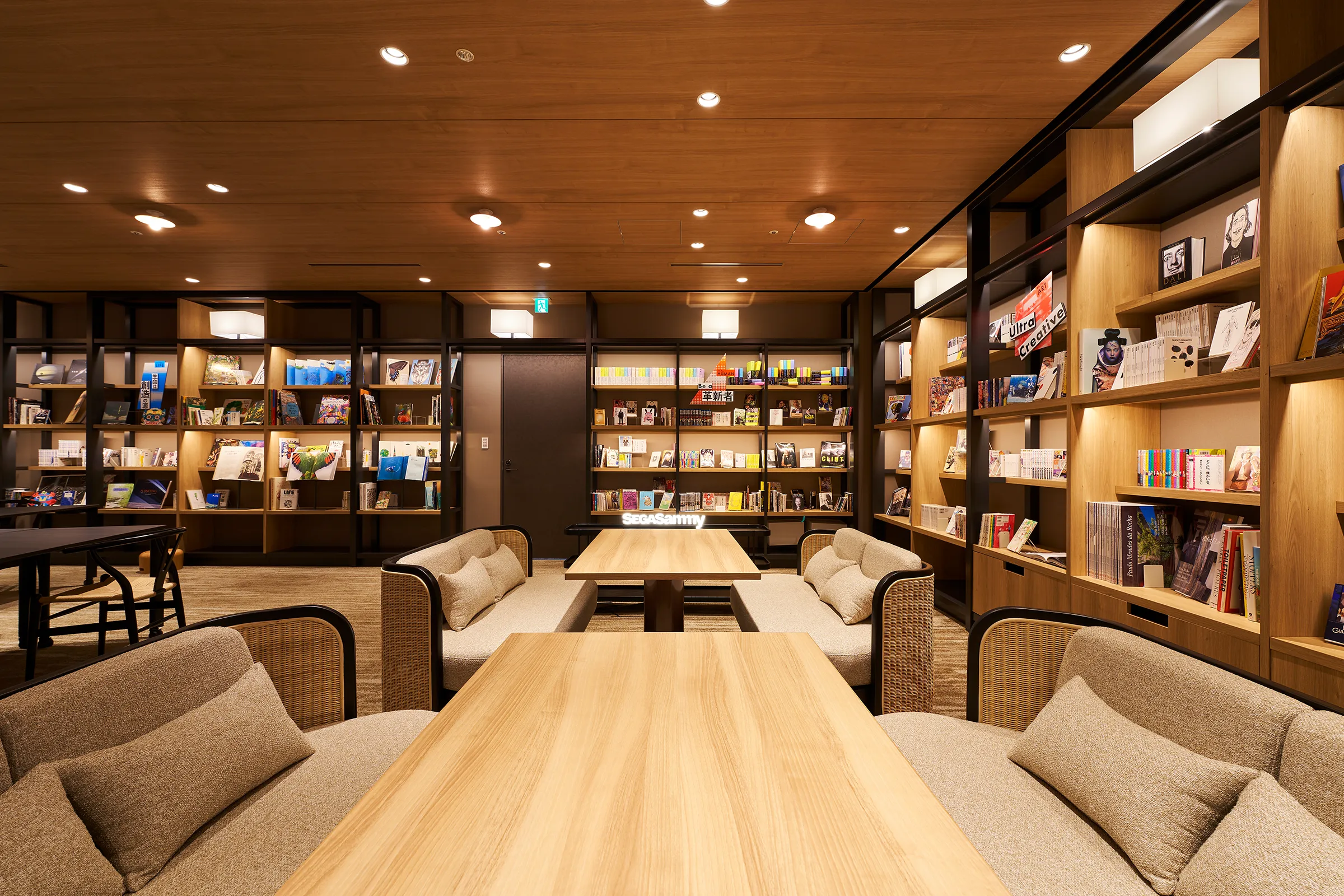
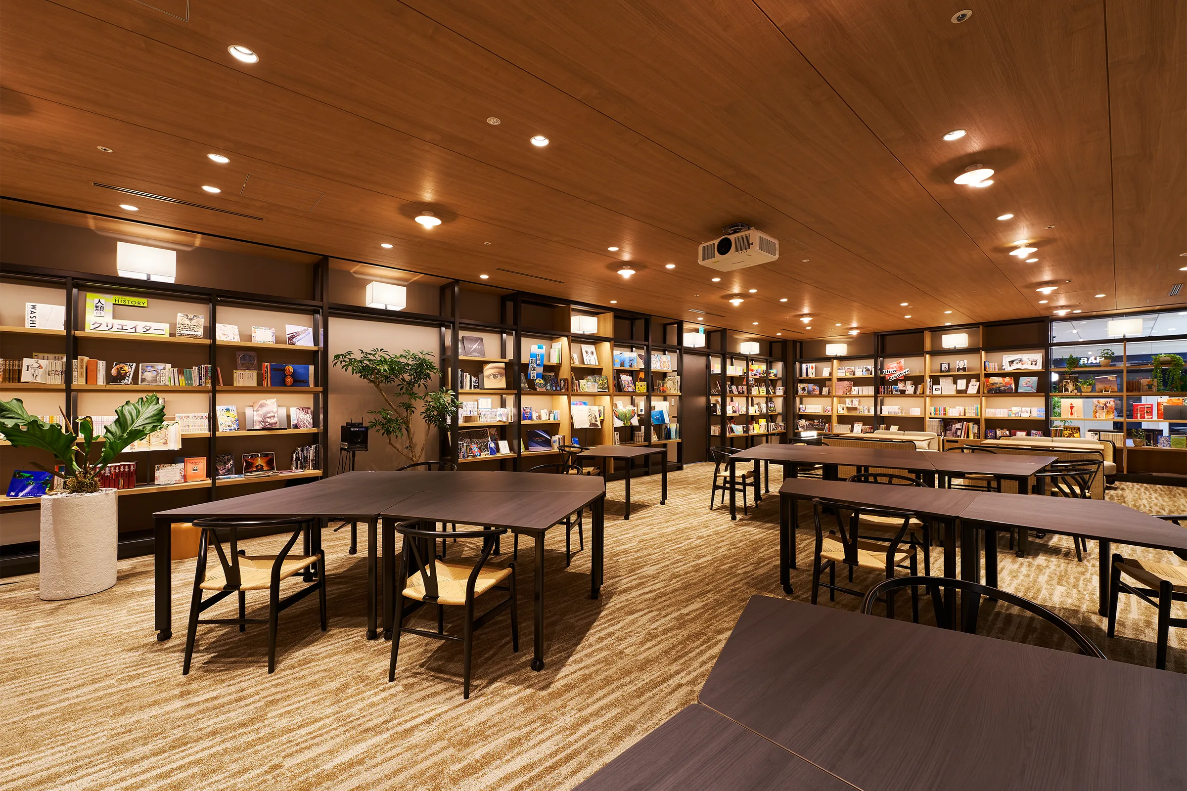
The library is shelved floor to ceiling, and the collection is rotated. A projector and screen are built into the room, so that it doubles as somewhere to show work.
05 · Cafeteria and bar
Three meals and a drink
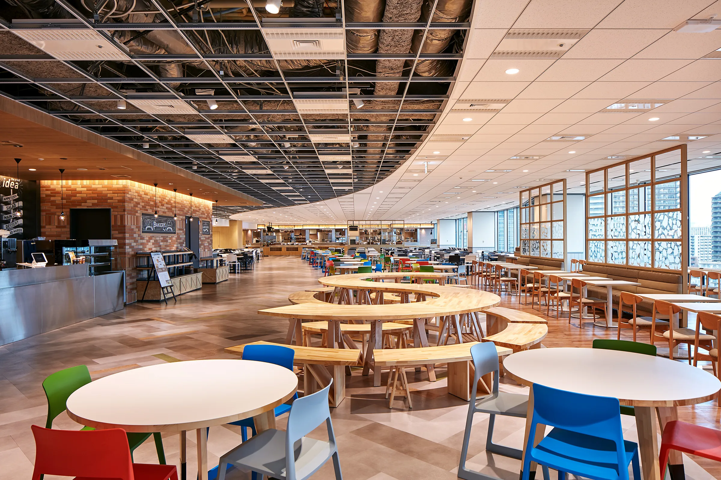
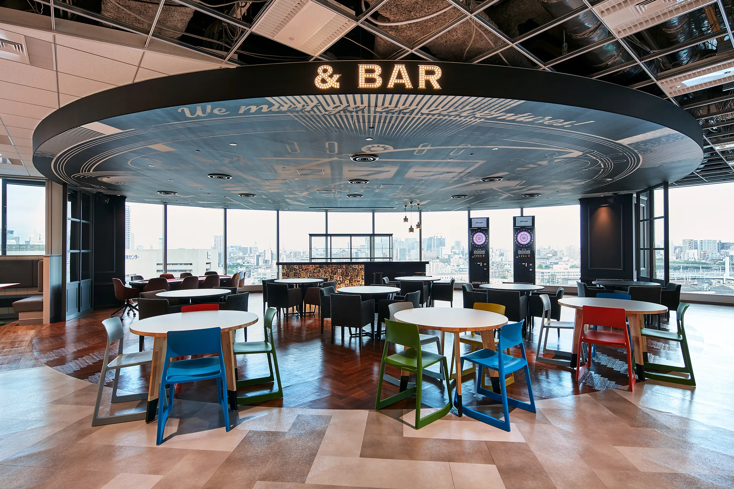
The cafeteria runs a daily set meal, a buffet and a morning service; at the end of the day the same room serves alcohol, under a sign that reads & BAR.